Tokyo 2020 Olympics Style Guide
2017
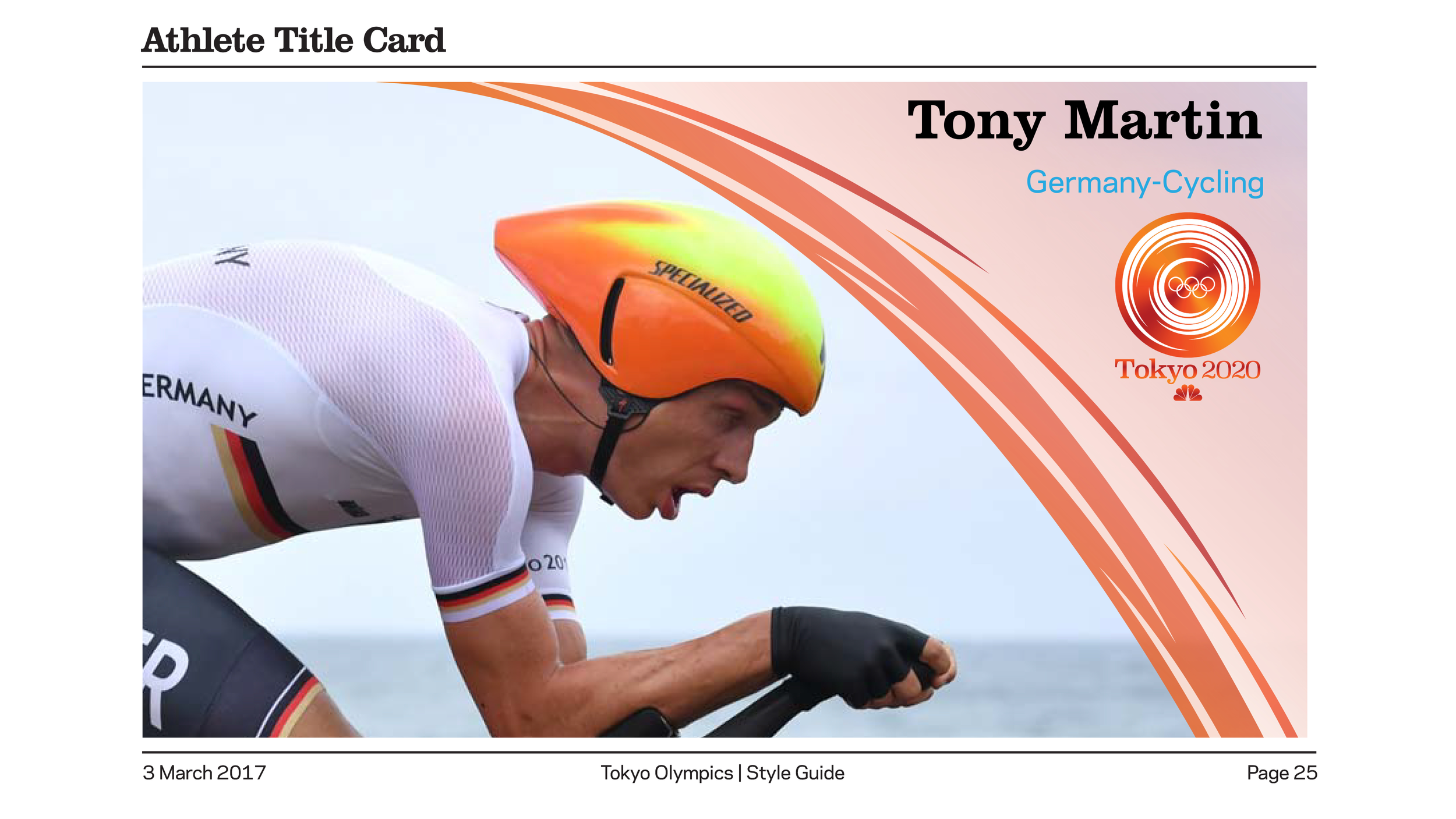
For one of my design classes at Ringling College, the goal for this project was to design a branding package and style guide for the 2020 Tokyo Summer Olympics. The inspiration for the design of the logo came from researching Japanese art and finding out about the family crests known as Kamons (or Mons). These symbols represent honor for families in Japan, a tradition that has continued up to the present day. The logo reflects the custom with the circular frame, incorporating the spiral design to reflect the energy and action of the Olympics. The warm color palette is meant to match the summer season when the Olympics would have been held. The overall package incorporates the aesthetic of the logo into on-air graphics, including title cards, infographics, and promo layouts, as well as off-air materials such as print design.
Style guide can be seen below.